Generally, Pinoys like to look before they buy. It’s a trait that’s innate in us – being sigurado. And it’s definitely not a bad thing, considering we all just want to make sure that whatever we’re purchasing on just about any buy and sell marketplace is truly sulit of our hard-earned money.
But as a seller, how do you make sure that your photos will catch the eyes of your buyers? It’s not enough to completely optimize your product pages because chances are, even if you’re at the top of the search charts, buyers are going to pass over your item if you have bad photos or none at all.
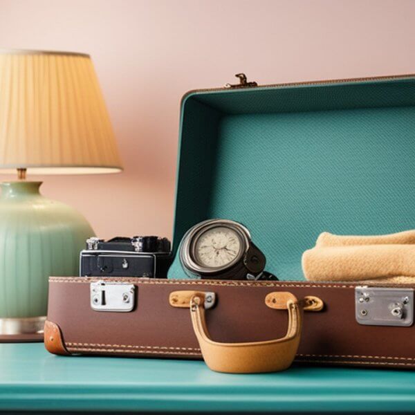
- Use a plain backdrop. Nobody likes cluttered photos where you can barely make out the item. Prop your product up against a plain colored backdrop that would help accentuate the color of your item.
- If possible, avoid using a flash. This causes reflections and shadows which doesn’t look pretty especially when you’re selling a phone with a reflective cover. Find proper lighting instead.
- Avoid blurs by using a tripod. Unsteady hands are not the best photo-taking hands, as it turns otherwise good-looking photos into fuzzy, depressing ones. If without a tripod, use a flat surface to steady your camera on.
- Opt for hi-res. It might be taking up a lot of space in your phone or camera’s memory but it helps your buyer zoom in on your product photos when you upload medium to high-resolution images.
- Go for every possible angle. Provide detailed close-ups of your item so buyers can see clearly if there are any flaws in your item. It’s also equally important to state these flaws in your product description.
- Show scale. Not all item sizes are clear so help avoid countless inquiries from confused buyers by placing definitive scaling items such as a coin or a ruler next to your product to help indicate its size.
- Adjust your camera’s white balance setting. You don’t want the entire Twitterati over your account discussing whether that dress you’re selling is #WhiteAndGold or #BlueAndBlack, don’t you? If you aren’t privy about #TheDress, click here to check it out.
- Fill the frame with your product. Again, in order for buyers to be able to see every detail of your item, put it front and center and make sure it takes up around 80% of the frame.
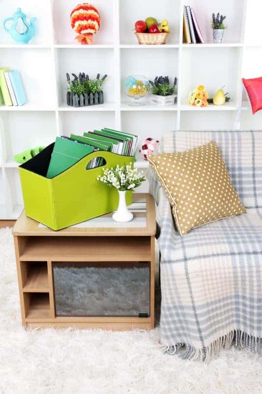
- Avoid props. Back to rule number 1 – nobody likes cluttered photos. Adding props to your product photos may actually confuse your buyers as to whether the props are included in your listing.
- Do not over-edit. Never go crazy on Photoshop and make your photos look like just about any stock photo. Buyers want to see photos that are closest to the actual item, not one that looks like it’s been lifted from the manufacturer’s website.
Better photos sell better. So generate sales for your listings by enticing prospective buyers with pictures that show, not just tell.


