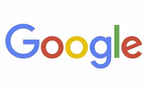
In its 17th year, tech giant Google unveils its new logo. Just a month after restructuring the company under a holding company under Alphabet, Google introduces their biggest redesign since 1999 with the new sans-serif four-colored logo:
The past years have seen Google’s logo go though a lot of different changes – from changing colors to 3D to an exclamation mark. In a blog post, the company explains the logo redesign:
“So why are we doing this now? Once upon a time, Google was one destination that you reached from one device: a desktop PC. These days, people interact with Google products across many different platforms, apps and devices—sometimes all in a single day. You expect Google to help you whenever and wherever you need it, whether it’s on your mobile phone, TV, watch, the dashboard in your car, and yes, even a desktop!
Today we’re introducing a new logo and identity family that reflects this reality and shows you when the Google magic is working for you, even on the tiniest screens. As you’ll see, we’ve taken the Google logo and branding, which were originally built for a single desktop browser page, and updated them for a world of seamless computing across an endless number of devices and different kinds of inputs (such as tap, type and talk).
It doesn’t simply tell you that you’re using Google, but also shows you how Google is working for you. For example, new elements like a colorful Google mic help you identify and interact with Google whether you’re talking, tapping or typing. Meanwhile, we’re bidding adieu to the little blue “g” icon and replacing it with a four-color “G” that matches the logo.”
The redesign is explained further by a video that showcases how the company has evolved over the years. Watch the video below:
They’ll soon be rolling out the new design across their products very soon so expect an update on your desktops and mobile apps.
What do you think of the new logo? Tell us in the comments section below!


